.~nan!.

Number of posts : 437
Age : 30
RepPower: : 
Reputation : 0
Points : 0
Registration date : 2008-02-23
 | |
TheJonas
Kings


Number of posts : 1387
Age : 31
RepPower: : 
Reputation : 0
Points : 0
Registration date : 2008-02-07
|  Subject: Re: Leo Messi | .~nan!. Subject: Re: Leo Messi | .~nan!.  Thu Aug 07, 2008 2:36 pm Thu Aug 07, 2008 2:36 pm | |
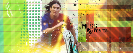
| I think you've done better, to be honest. The reder isnt really good. The dots work nice, would be better on a clipping mask i think. But they're still very nice. Else it looks to blurry, effects could be better. The yellow thingy is okay, but maybe move it more to the right. The background is weird. Too many colours. If you made it into a general colour (put a photofilter on, with high opacity) i think it would look quite good, but the many colours ruin it. Text is nice, but place it closer to Messi. And remember a border, allways a border  | |
|
.Tiempo
Kings

Number of posts : 1830
Age : 29
RepPower: :
Reputation : 0
Points : 0
Registration date : 2008-03-29
| | Subject: Re: Leo Messi | .~nan!. Thu Aug 07, 2008 4:18 pm | |
| i thought i commented this?anyway,hmm dunno about this one mat not really feeling this style tbh,the bg looks good,the render isn't fitting with the bg they look like two different styles imo,too much blur on it the splatter isn't fitting,the text need work,keep trying new styles mate kiu! | |
|
Sponsored content
| | Subject: Re: Leo Messi | .~nan!. | |
| |
|