Poldi

Number of posts : 47
RepPower: : 
Reputation : 0
Points : 0
Registration date : 2008-02-09
 |  Subject: .:Eduardo Da Silva:. - My latest but far not my best.. Subject: .:Eduardo Da Silva:. - My latest but far not my best..  Mon Mar 03, 2008 12:09 pm Mon Mar 03, 2008 12:09 pm | |
| 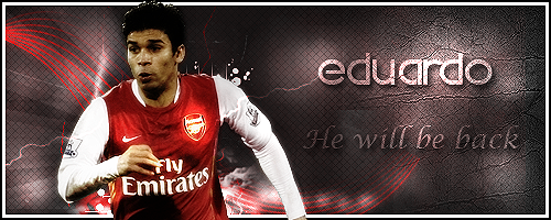 Comments please
| |
|
Air¹
Kings


Number of posts : 1275
Age : 30
RepPower: : 
Reputation : 0
Points : 0
Registration date : 2008-02-03
| | Subject: Re: .:Eduardo Da Silva:. - My latest but far not my best.. Mon Mar 03, 2008 12:52 pm | |
| I like your textures, also the background its really nice!, I also love the text especially the Eduardo but the effects on the renders are not nice, you need improving on that. Maybe adding more textures behind the render will make it better. Also you want a better border because this one is a bit plain  . | |
|
MallerLFC
elitemember


Number of posts : 2017
Age : 31
RepPower: :
Reputation : 0
Points : 0
Registration date : 2008-02-08
| | Subject: Re: .:Eduardo Da Silva:. - My latest but far not my best.. Mon Mar 03, 2008 1:49 pm | |
| In general it looks a bit overdone mate. Theres a lot of textures and patterns, which makes it a bit messy, try to tune it down. Maybe you already know The render looks good, but i think it needs some lightning in the face, work on it, else it looks okay, try blending it into the background so you dont get that sharp edge. The little effects counts, and you made some good ones, i like the should and the left part of the sig, looks good! At last i'd say work a little with the text, the 'He will be back' doesn't fit as good as the Eduardo part, which looks good. keep it up! | |
|
meh
Golden Members


Number of posts : 294
RepPower: :
Reputation : 0
Points : 0
Registration date : 2008-02-07
| | Subject: Re: .:Eduardo Da Silva:. - My latest but far not my best.. Tue Mar 04, 2008 6:27 am | |
| i agree with maller, it looks overdone.. and the render doesn't go with the bg style. tone down the use of textures and patterns in the bg, and add more depth to it. some coloring work would do good too, to add some variation in the bg. make the text a little smaller to move the focus away from it and more over to the render, and place the border on top of everything - including the render. tone down the bright lighting on the arsenal logo and lighten up his face more, keep it smooth though and not overdone  and remember to blend in the render! | |
|
D.nomyaR

Number of posts : 221
Age : 37
RepPower: :
Reputation : 0
Points : 0
Registration date : 2008-02-06
| | Subject: Re: .:Eduardo Da Silva:. - My latest but far not my best.. Tue Mar 04, 2008 10:57 am | |
| I really like your texture(s) and background, and also the eduardo text isnt bad, but the render needs to be blended more into the BG, and you have to change the colour on your border, doesnt fit with the rest of your signature. And "he will be back" text could be smaller and also closer to the Eduardo text. KIU  | |
|
OmarBæk

Number of posts : 220
RepPower: :
Reputation : 0
Points : 0
Registration date : 2008-02-08
| | Subject: Re: .:Eduardo Da Silva:. - My latest but far not my best.. Tue Mar 04, 2008 11:12 pm | |
| I like the text really much, and also the background, but not the effects on the render, And the border dosnt fit in,
KiU :b | |
|
Sponsored content
| | Subject: Re: .:Eduardo Da Silva:. - My latest but far not my best.. | |
| |
|


