| | .~nan!. Icons < |  |
|
+5D.nomyaR MallerLFC Air¹ ~d3ni .~nan!. 9 posters |
|
| Author | Message |
|---|
.~nan!.

Number of posts : 437
Age : 30
RepPower: : 
Reputation : 0
Points : 0
Registration date : 2008-02-23
|  Subject: .~nan!. Icons < Subject: .~nan!. Icons <  Sun Mar 09, 2008 1:40 pm Sun Mar 09, 2008 1:40 pm | |
|
Last edited by .~nan!. on Wed Aug 06, 2008 2:48 pm; edited 1 time in total | |
|
| | |
~d3ni
Moderators


Number of posts : 570
Age : 29
RepPower: : 
Reputation : 0
Points : 0
Registration date : 2008-02-27
| | Subject: Re: .~nan!. Icons < Sun Mar 09, 2008 1:44 pm | |
| WOaaaaa  This avas ar wonderful,nice and beautiful  congrats Nani,my favourites:  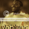 | |
|
| | |
Air¹
Kings


Number of posts : 1275
Age : 30
RepPower: : 
Reputation : 0
Points : 0
Registration date : 2008-02-03
| | Subject: Re: .~nan!. Icons < Sun Mar 09, 2008 1:45 pm | |
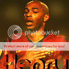
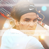
| This Ava:  By miles mate is your best! I really like the effects and textures you use, the blending are perfect!. Some of your avas even your newest are really nice because I like the blur you have put on the stock it really fits in but sometimes you have overdone it. Your oldest lol mmm your text are not so nice hehe I must say!, the blending are ok but not so nice either. Overal you have improved at avas mate!. KIU Stick to this kind hehe : | |
|
| | |
.~nan!.
Number of posts : 437
Age : 30
RepPower: :
Reputation : 0
Points : 0
Registration date : 2008-02-23
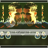
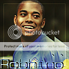
| | Subject: Re: .~nan!. Icons < Sun Mar 09, 2008 2:56 pm | |
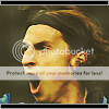
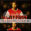
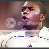
|  New Robhino Ava..For A Battle With Maller LFC .. Tell Me What You Think .. | |
|
| | |
MallerLFC
elitemember


Number of posts : 2017
Age : 31
RepPower: :
Reputation : 0
Points : 0
Registration date : 2008-02-08
| | Subject: Re: .~nan!. Icons < Sun Mar 09, 2008 3:01 pm | |
| Great ones mate. I agree with Xplosive, the Cristiano one is your best by far, it's really really awesome! You're great at the double stock effect, its great in your others too (Uuh, Kanye  ) But your blending is getting really really good, and you can see a huge improvement on the effects, you make some fantastic effects now. And your text have been good from the start. Great work mate, keep it up! | |
|
| | |
MallerLFC
elitemember
Number of posts : 2017
Age : 31
RepPower: :
Reputation : 0
Points : 0
Registration date : 2008-02-08
| | Subject: Re: .~nan!. Icons < Sun Mar 09, 2008 3:01 pm | |
| Oh and nice entry to our battle | |
|
| | |
.~nan!.
Number of posts : 437
Age : 30
RepPower: :
Reputation : 0
Points : 0
Registration date : 2008-02-23
| | Subject: Re: .~nan!. Icons < Sun Mar 09, 2008 3:17 pm | |
| Thanks For The Comment Mate ! Really Appreciated ! | |
|
| | |
.~nan!.
Number of posts : 437
Age : 30
RepPower: :
Reputation : 0
Points : 0
Registration date : 2008-02-23
| | Subject: Re: .~nan!. Icons < Tue Mar 11, 2008 1:21 pm | |
| | |
|
| | |
MallerLFC
elitemember
Number of posts : 2017
Age : 31
RepPower: :
Reputation : 0
Points : 0
Registration date : 2008-02-08
| | Subject: Re: .~nan!. Icons < Tue Mar 11, 2008 3:46 pm | |
| Fabolous colors mate! And lovely effects! Looks really smooth and nice, but i most say mate, i'm not the biggest fan of the despeckle effect, it's a really nice idea, but maybe a bit overdone. I'd try tune it down a bit, else try with something else, maybe some gaussian blur or some simple sharpending, i don't know mate. Up to you Keep it up! | |
|
| | |
.~nan!.
Number of posts : 437
Age : 30
RepPower: :
Reputation : 0
Points : 0
Registration date : 2008-02-23
| | Subject: Re: .~nan!. Icons < Wed Mar 12, 2008 1:36 pm | |
| | |
|
| | |
D.nomyaR

Number of posts : 221
Age : 37
RepPower: :
Reputation : 0
Points : 0
Registration date : 2008-02-06
| | Subject: Re: .~nan!. Icons < Wed Mar 12, 2008 2:04 pm | |
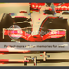
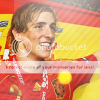
| Good ones mate, but I think they are a little overdone mate. I like avas to be simple and clean, and maybe with some cool styles. But the F1 one is good, like the text too. KIU  | |
|
| | |
MallerLFC
elitemember
Number of posts : 2017
Age : 31
RepPower: :
Reputation : 0
Points : 0
Registration date : 2008-02-08
| | Subject: Re: .~nan!. Icons < Wed Mar 12, 2008 2:10 pm | |
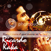
| The Ronaldinho one is great, lovely blending, i love the color scheme! Not often you get to say its a nice background but it is  and the effects is good. The F1 one is not my favorite to say it that way. The color scheme looks a little weird, the same with the text, i dont think the clipping mask is fitting. Good lightning though. Keep it up mate! | |
|
| | |
.~nan!.
Number of posts : 437
Age : 30
RepPower: :
Reputation : 0
Points : 0
Registration date : 2008-02-23
| |
| | |
MallerLFC
elitemember
Number of posts : 2017
Age : 31
RepPower: :
Reputation : 0
Points : 0
Registration date : 2008-02-08
| | Subject: Re: .~nan!. Icons < Mon Mar 17, 2008 10:29 am | |
| Last one is okay mate, i think the sharpen is a bit over doone, his cheek looks awfully weird to be honest The colors is a nice touch, looks really cool actually, and the duplicate effect in the left site is a nice touch too! Keep it up | |
|
| | |
.~nan!.
Number of posts : 437
Age : 30
RepPower: :
Reputation : 0
Points : 0
Registration date : 2008-02-23
| | Subject: Re: .~nan!. Icons < Mon Mar 17, 2008 10:44 am | |
| Thanks For The Constructive Comment Mate...Really Appreciate It ..  | |
|
| | |
.~nan!.
Number of posts : 437
Age : 30
RepPower: :
Reputation : 0
Points : 0
Registration date : 2008-02-23
| |
| | |
Air¹
Kings
Number of posts : 1275
Age : 30
RepPower: :
Reputation : 0
Points : 0
Registration date : 2008-02-03
| | Subject: Re: .~nan!. Icons < Tue Mar 18, 2008 3:07 pm | |
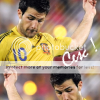
| Its another great ava imo. The colour and lightening is nice, the two stock effect is good an clever, the little plus is ok but i would say can improve, but I think you have slightly done it with the blurness on his nose. The sharpen is perfect. The border can be improved IMO by adding a white layer like on sig. KIU | |
|
| | |
.~nan!.
Number of posts : 437
Age : 30
RepPower: :
Reputation : 0
Points : 0
Registration date : 2008-02-23
| | Subject: Re: .~nan!. Icons < Tue Mar 18, 2008 3:18 pm | |
| Thanks For The Constructive Comment Mate ! Appreciated ! | |
|
| | |
MallerLFC
elitemember
Number of posts : 2017
Age : 31
RepPower: :
Reputation : 0
Points : 0
Registration date : 2008-02-08
| | Subject: Re: .~nan!. Icons < Tue Mar 18, 2008 3:56 pm | |
| I agree a 100 % with Xplosive mate, it's a really nice avatar. The colors and blending is really good, same with the lightning. The double effect is really good too, you master it mate As Rage says, the plus is okay but could be improved, in my oppinion in both placement and clipping mask. The details is good, the placement of the picture (Ronaldos placement etc) is really good and the sharpeness, again as Rage said, is perfect. As Rage says maybe work on the border, 2 px totally black in top and bottom and then a 1 pix outline as overlay or something Anyway good one mate, keep it up! | |
|
| | |
.~nan!.
Number of posts : 437
Age : 30
RepPower: :
Reputation : 0
Points : 0
Registration date : 2008-02-23
| | Subject: Re: .~nan!. Icons < Sat Mar 22, 2008 7:32 am | |
| | |
|
| | |
MallerLFC
elitemember
Number of posts : 2017
Age : 31
RepPower: :
Reputation : 0
Points : 0
Registration date : 2008-02-08
| | Subject: Re: .~nan!. Icons < Sat Mar 22, 2008 10:19 am | |
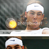
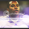
| Mixed feelings on the new style mate, i really love the blending, but the effect/sharpen/despeckle thing is just not my taste i think  - I think you could achieve more with a normal sharpen, of course it wouldnt be as spectacular but i'm sure you could think of something else mate But i'd say, the Raul is okay, Higuain is under your standard, the Nani one is actually really good, not in total same style but really good. Keep it up mate | |
|
| | |
~rdm¹
Golden Members


Number of posts : 1008
Age : 29
RepPower: : 
Reputation : 0
Points : 0
Registration date : 2008-06-22
| | Subject: Re: .~nan!. Icons < Tue Jun 24, 2008 2:13 am | |
| Ye really nice work mate Light works and colours are nice KIU and keep making them | |
|
| | |
.~nan!.
Number of posts : 437
Age : 30
RepPower: :
Reputation : 0
Points : 0
Registration date : 2008-02-23
| | Subject: Re: .~nan!. Icons < Sun Jul 13, 2008 7:44 am | |
| | |
|
| | |
TheJonas
Kings

Number of posts : 1387
Age : 31
RepPower: :
Reputation : 0
Points : 0
Registration date : 2008-02-07
| | Subject: Re: .~nan!. Icons < Mon Jul 14, 2008 6:09 pm | |
| You van see your improvement, my favourite must be the latest Cesc ava. Looks really nice, i like the simple style. The duplication looks good, and the lightning is nice. Think you should try and stick to that style. Keep it up, mate | |
|
| | |
~rdm¹
Golden Members
Number of posts : 1008
Age : 29
RepPower: :
Reputation : 0
Points : 0
Registration date : 2008-06-22
| | Subject: Re: .~nan!. Icons < Mon Jul 14, 2008 11:42 pm | |
| Great update mate there all your best works yet imo KIU | |
|
| | |
Sponsored content
| | Subject: Re: .~nan!. Icons < | |
| |
|
| | |
| | .~nan!. Icons < | |
|