Henr¹

Number of posts : 178
RepPower: : 
Reputation : 0
Points : 0
Registration date : 2008-06-23
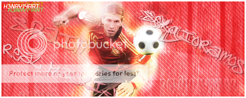
 |  Subject: Sergio Ramos Subject: Sergio Ramos  Sat Jun 28, 2008 3:41 am Sat Jun 28, 2008 3:41 am | |
| | |
|
~rdm¹
Golden Members


Number of posts : 1008
Age : 29
RepPower: : 
Reputation : 0
Points : 0
Registration date : 2008-06-22
| | Subject: Re: Sergio Ramos Sat Jun 28, 2008 3:58 am | |
| Not bad mate here but a little busy and messy in places  Well the render seems a little bright and the face is to red tbh mate Try adding some smooth textures, colours and also light work mate Not sure on the bg the wood texture doesnt really fit in this kind of signature mate try adding some lines and brushes for the bg. Text is bad though all over the place aswell mate try keeping it simple KIU | |
|
.Tiempo
Kings


Number of posts : 1830
Age : 29
RepPower: :
Reputation : 0
Points : 0
Registration date : 2008-03-29
| | Subject: Re: Sergio Ramos Sat Jun 28, 2008 4:05 am | |
| Not Bad Mate,Too Messy Overall Tbh,The BG Doesn't Look Nice The Wood Texture Does Not Fit With The Red Colour And Diagnol Lines!  ,The Render Looks A Bit Too Red Aswell,The Effects Need Work,Not Sure About Those Lights On His Arms Etc.The Texts Look Too Draft And Messy Remove Them Mate.Keep At It! | |
|
Henr¹
Number of posts : 178
RepPower: :
Reputation : 0
Points : 0
Registration date : 2008-06-23
| | Subject: Re: Sergio Ramos Sat Jun 28, 2008 4:07 am | |
| Thanks for the feedback.
What does Tbh means? | |
|
~rdm¹
Golden Members
Number of posts : 1008
Age : 29
RepPower: :
Reputation : 0
Points : 0
Registration date : 2008-06-22
| | Subject: Re: Sergio Ramos Sat Jun 28, 2008 4:10 am | |
| | |
|
Henr¹
Number of posts : 178
RepPower: :
Reputation : 0
Points : 0
Registration date : 2008-06-23
| | Subject: Re: Sergio Ramos Sat Jun 28, 2008 4:39 am | |
| Made another version V2:  | |
|
AR7

Number of posts : 349
Age : 28
RepPower: :
Reputation : 0
Points : 0
Registration date : 2008-05-09
| | Subject: Re: Sergio Ramos Sat Jun 28, 2008 5:18 am | |
| Not bad. But still to messy in parts. Imo it is to red. The BG is ok but could be better. The text is bad and dosen't fit try and get maybe just one main text. The lighting effects are ok but could be improved. The double is ok but imo it dosen't fit here. The border is good KIU mate. | |
|
.Reno~

Number of posts : 166
Age : 29
RepPower: :
Reputation : 0
Points : 0
Registration date : 2008-06-24
| | Subject: Re: Sergio Ramos Sat Jun 28, 2008 5:49 am | |
| Not bad, the scan lines stand out to much imo, just lower the opacity, but the textures look fine, border looks good and the text is beter than v1 but still could be improved, keep practicing mate. | |
|
Sponsored content
| | Subject: Re: Sergio Ramos | |
| |
|