RobBenko

Number of posts : 36
Age : 32
RepPower: : 
Reputation : 0
Points : 0
Registration date : 2008-07-22
 |  Subject: Messi // Robbenko Subject: Messi // Robbenko  Tue Jul 22, 2008 4:34 pm Tue Jul 22, 2008 4:34 pm | |
| 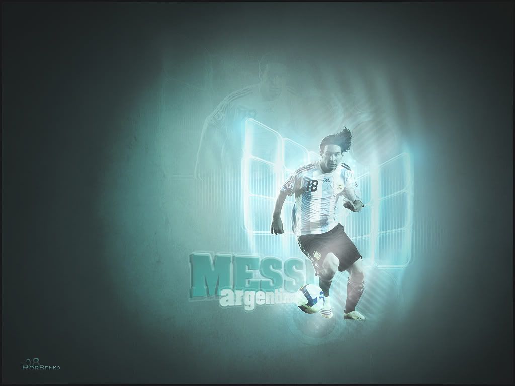 Hello again  This is my first wall here and my second piece of work for the site! Okay, I tried a few things with this wall. Comments greatly appreciated!  | |
|
TheJonas
Kings


Number of posts : 1387
Age : 31
RepPower: : 
Reputation : 0
Points : 0
Registration date : 2008-02-07
| | Subject: Re: Messi // Robbenko Tue Jul 22, 2008 4:55 pm | |
| Crap, i've just wrote i comment, then i by a mistake press the 'watch topic' button, and my comment is gone. Damn! Well, here goes again: You've got some real nice ideas in here. The render looks nice, alittle simple, meaning no big effects. Maybe add some textures and such to get more effects to the render. His head, arms and legs look way too blue. The textures behind Messi looks really nice, though. The background look okay, could be abit better. Too much light and colour difference from the middle to the sites. Alittle boring aswell, add a pic of Camp Nou or something to make it more interresting. The text looks nice, i think. The effect look good, maybe add some colour effect on there. Take the brush tool on a soft brush, 20 px or something like that, make a new layer and brush on the text. Put that layer on overlay, usually looks really good. It got quite long, hope it was usefull  Btw, this must have been my post nr. 1000 | |
|
RobBenko
Number of posts : 36
Age : 32
RepPower: :
Reputation : 0
Points : 0
Registration date : 2008-07-22
| | Subject: Re: Messi // Robbenko Tue Jul 22, 2008 5:10 pm | |
| Again thanks TheJonas for the great comments. They are really helpful and I will build from them! Oh and congrats!  | |
|
.Tiempo
Kings

Number of posts : 1830
Age : 29
RepPower: :
Reputation : 0
Points : 0
Registration date : 2008-03-29
| | Subject: Re: Messi // Robbenko Wed Jul 23, 2008 4:18 am | |
| Very Nice Wall Mate,The BG Could Be Improved,And Maybe Expand It Abit If You Know What I Mean,Try Not To Make It As Blue Either,The Render Looks Okay,But There Are Too Many Lighting Effects Going On IMO,His face Looks Alittle Too Blue Aswell,The Shape Behind The Render Fits Well Maybe Add A Few Of Those In Front Of The Render,Overall It Needs Some More Non-Light Textures If You Know What I Mean,The Text Looks Great Keep It Up Mate! | |
|
RobBenko
Number of posts : 36
Age : 32
RepPower: :
Reputation : 0
Points : 0
Registration date : 2008-07-22
| | Subject: Re: Messi // Robbenko Wed Jul 23, 2008 8:35 am | |
| Thannks .Tiempo , I agree with your comments about the lighting, I will try and improve for my next wall! | |
|
R¹sfX
Moderators


Number of posts : 366
Age : 30
RepPower: : 
Reputation : 0
Points : 0
Registration date : 2008-06-20
| | Subject: Re: Messi // Robbenko Wed Jul 23, 2008 9:28 am | |
| I like it mate The bg is quite nice, simple but nice. I think you could have used a few more textures though to give it some depth. The render looks nice, it blends well with the bg and the textures behind it look nice too. The double render seems to fit well. Text is really nice i like the 3d effect. I think overall though the text and some parts of the render need some more contrast though, the colour is a bit weak. KIU mate | |
|
RobBenko
Number of posts : 36
Age : 32
RepPower: :
Reputation : 0
Points : 0
Registration date : 2008-07-22
| | Subject: Re: Messi // Robbenko Wed Jul 23, 2008 1:52 pm | |
| Thanks for your comment mate! I will try to apply what you say into my next wall! | |
|
Sponsored content
| | Subject: Re: Messi // Robbenko | |
| |
|


